Enedym is excited to introduce our refreshed brand identity. The visual identity system brings to life our vision for positive change through novel, digitized, and cost-effective electric motors and power electronics. A series of conversations among the Enedym team had a single aim: to update our visual identity in a way that is both technically and symbolically meaningful, and we are proud to introduce the initial elements of our brand foundation.
Electrification is at the heart of Enedym. The universal symbol of electrification, the lightning bolt, is the basis of inspiration for the logo, and represents the force upon which our technologies are built.

The Enedym logomark is an abstraction of a lightning bolt — a simple, modern form that is recognizable and clear. The forward, upward direction of the bolt implies positive progress toward change. It also embodies our mission to power a paradigm shift in the electric motor industry.

The bold, clear design of the wordmark integrates the bolt in an unexpected, but intuitive way. Standing alone, the bolt is an iconic and flexible signature of our brand.

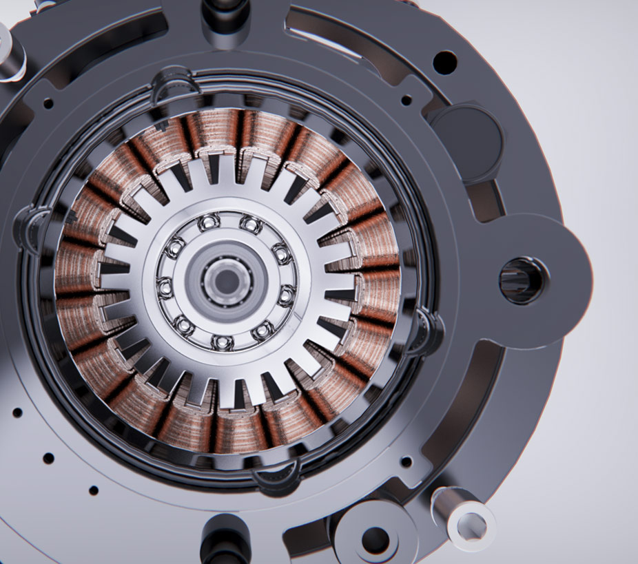
Enedym’s colors are inspired by the material that is core to electrification – copper. Electrically, copper has high conductivity and low resistivity; properties that enable excellent electrical flow. These characteristics are symbolic of the company’s culture– our people and processes create an environment where innovation thrives. Visually, copper’s richness and warmth stands out as a unique accent when applied to brand touchpoints and marketing materials. The result is a visual identity that reflects a bold commitment to positive change.
We are actively building a brand that will grow and evolve with our company. Our visual brand language is only the beginning – through our people, products, and partnerships, we are excited to share our vision of disruption for good. We look forward to working together to change how the world moves.